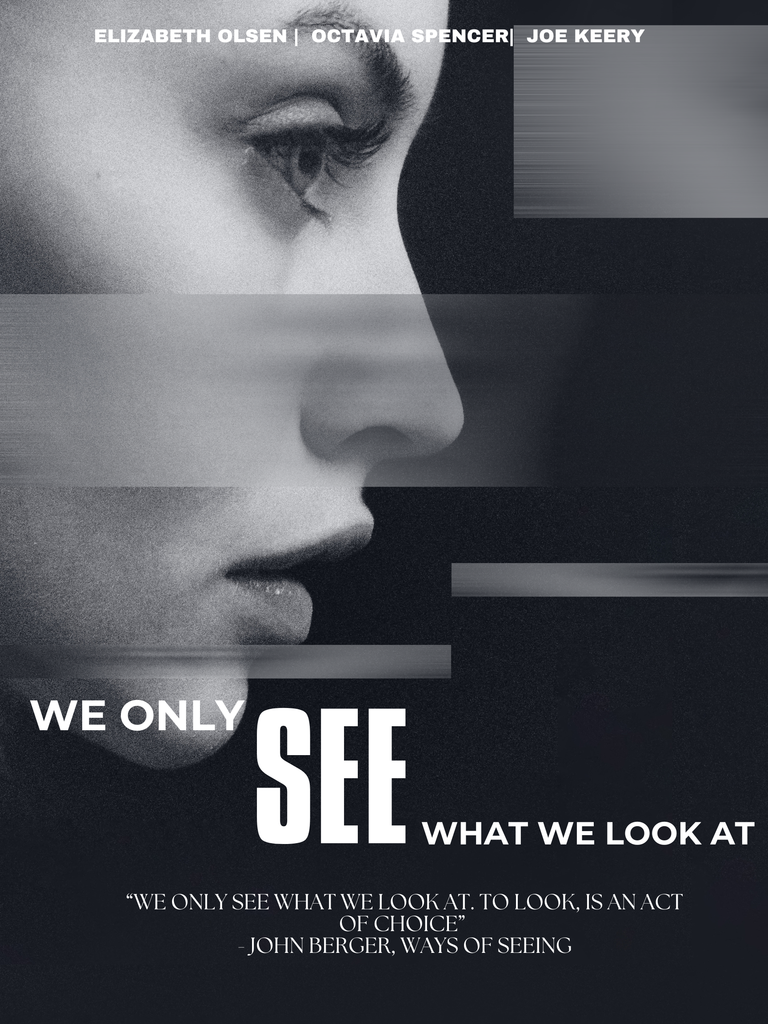
For my movie poster, I chose the phrase “We Only See What We Look At” from John Berger’s Ways of Seeing. I was drawn to this phrase because it suggests that seeing is an active choice rather than something that simply happens. Berger explains that “to look is an act of choice,” meaning that what we focus on affects how we experience and understand the world.
I wanted my poster to visually communicate this idea by making the viewer focus on the eye and face in the visual I used.
For the font, I made “SEE” much bolder than the title. Making “SEE” significantly larger emphasizes the word and immediately draws the viewer’s attention toward it. I wanted the font to demonstrate Berger’s argument that we actively choose where to look.
I also used a black-and-white close-up of a woman’s face, with an emphasis on her eye. The close-up makes the act of looking feel important to the poster. I also added a distorted section across the image, blurring a part of the face and making the viewer search for what is visible. This reinforces the idea that what we see depends on what we choose to focus on. The black palette creates a darker, mysterious feeling.
I also included Berger’s longer statement, “We only see what we look at. To look is an act of choice,” near the bottom of the poster, which helps to provide context for the title. Overall, I wanted the poster to make the viewer experience Berger’s idea rather than simply read about it.
